Project area
Publishing
Year
2023
Zátopek Marathon
A journey trough visual design and UX/UI
Project overview
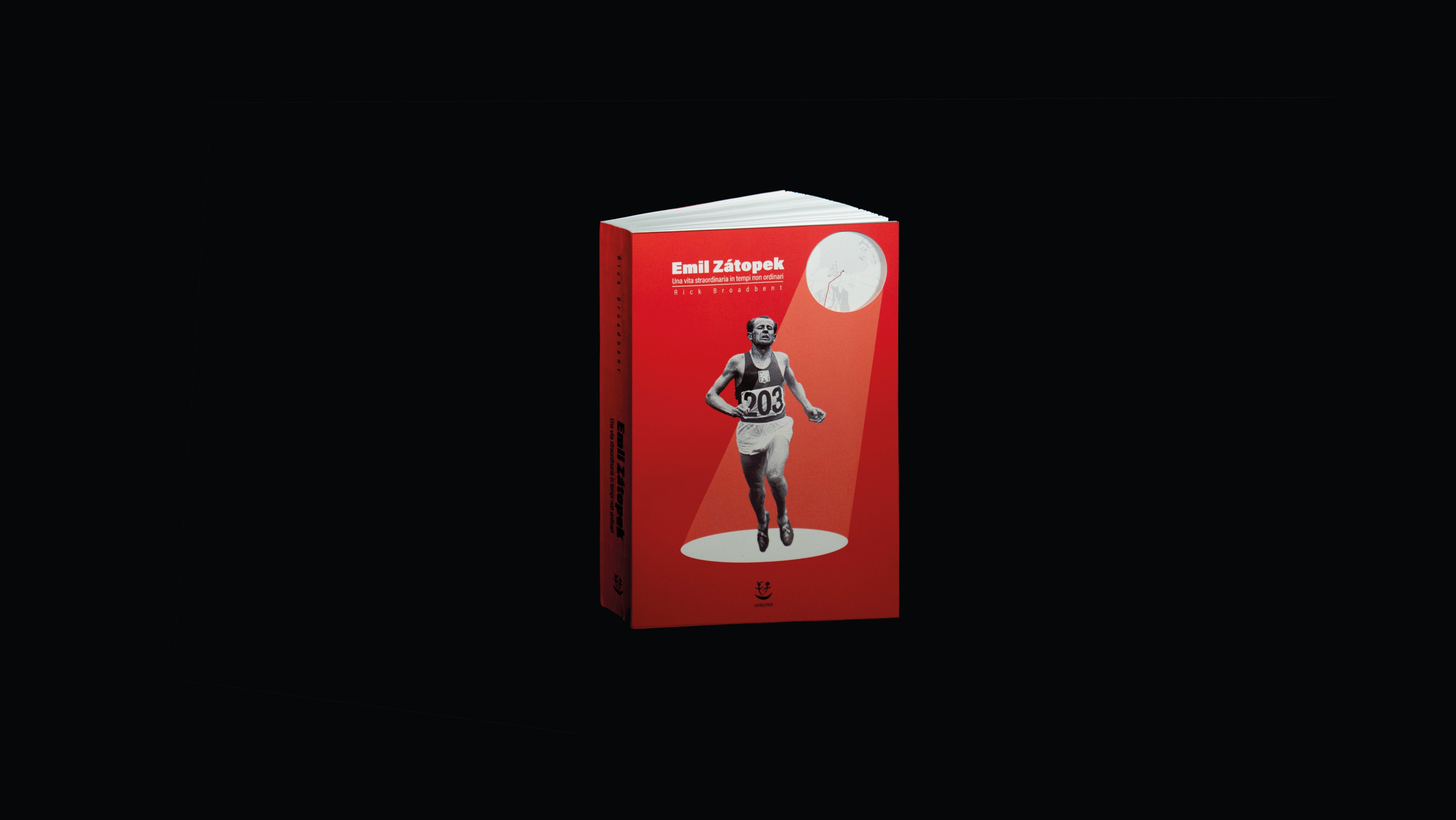
The goal of the project was to graphically reinterpret the existing text, Endurance: The Extraordinary Life and Times of Emil Zátopek, by Rick Broadbent, into a visual book to enhance its communicative impact.
Concept inspiration
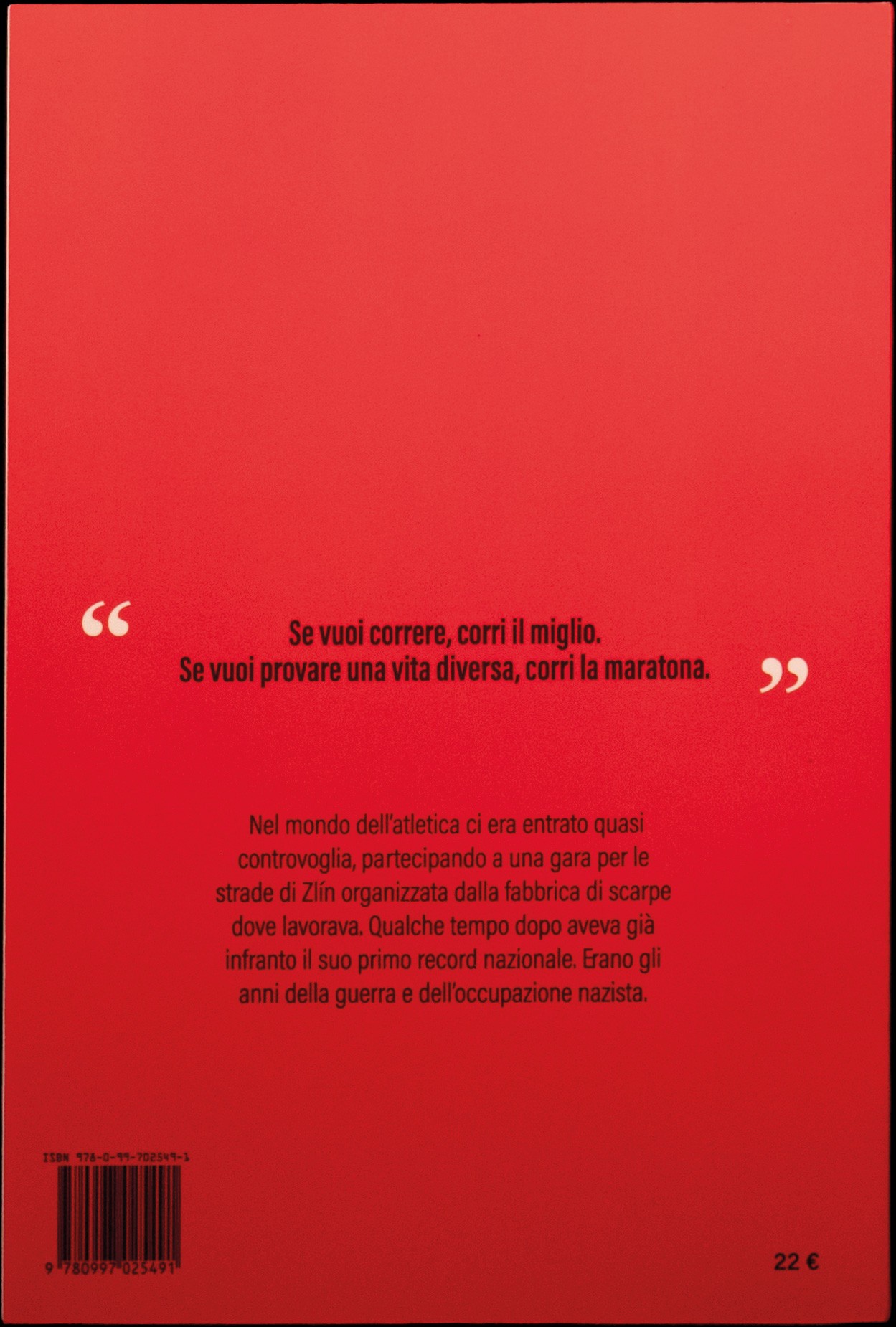
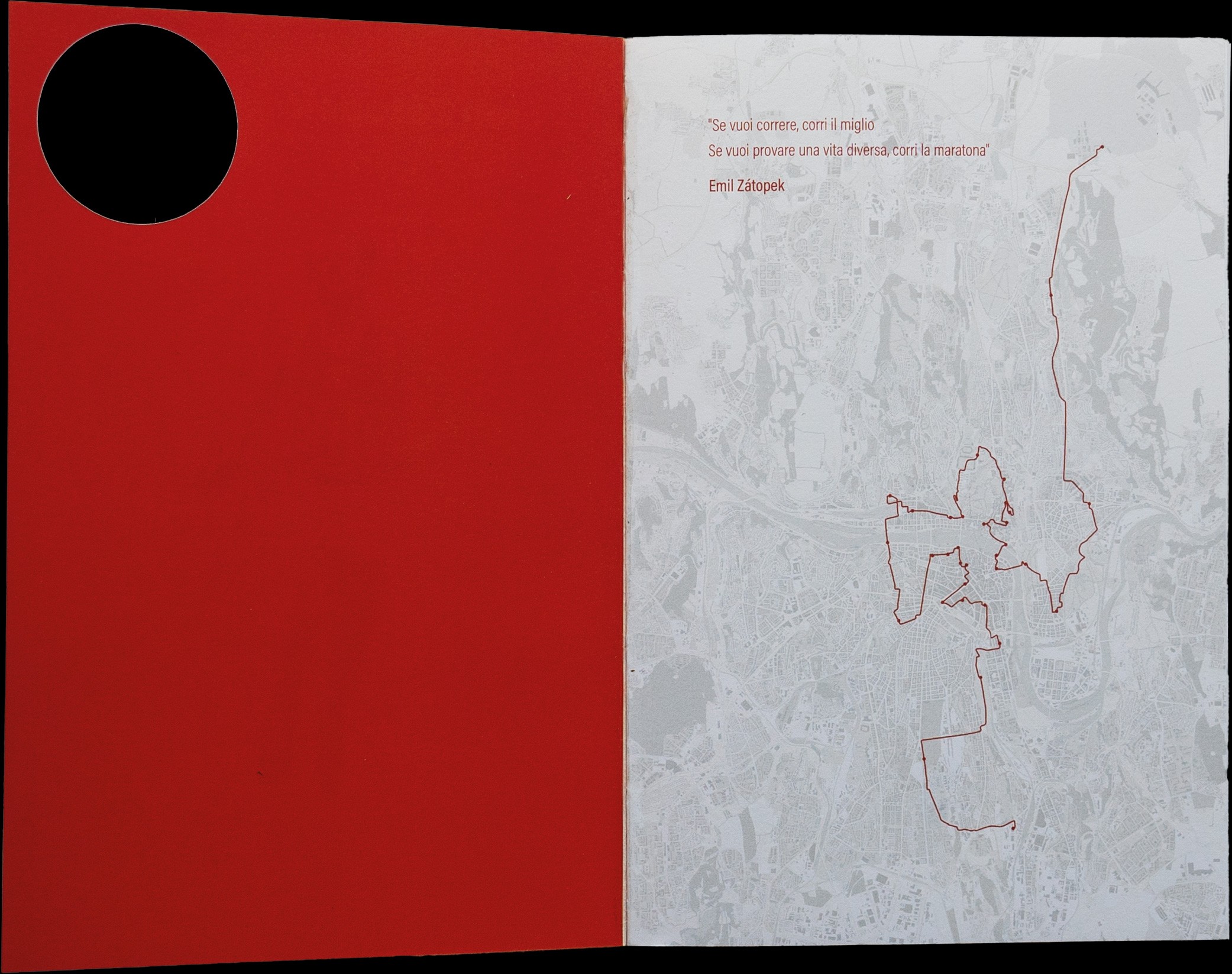
"If you want to run, run a mile. If you want to experience a different life, run a marathon."
- Zátopek
Concept idea
Metaphorically relive Zátopek’s life through a marathon, capturing the essence of endurance and resistance against totalitarianism.
Method
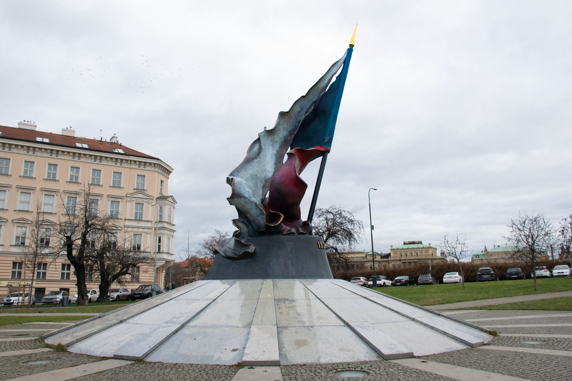
Annotating the original book to identify key locations in Prague, relevant historical events, and figures.
Outcome
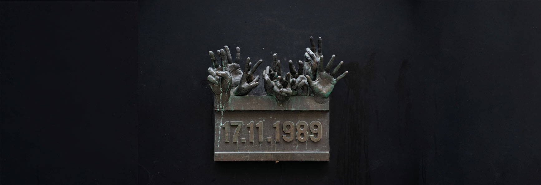
Identified 40 potential stops, categorized into sculptures, churches, museums, public structures, shops, and commemorative plaques.
Purpose
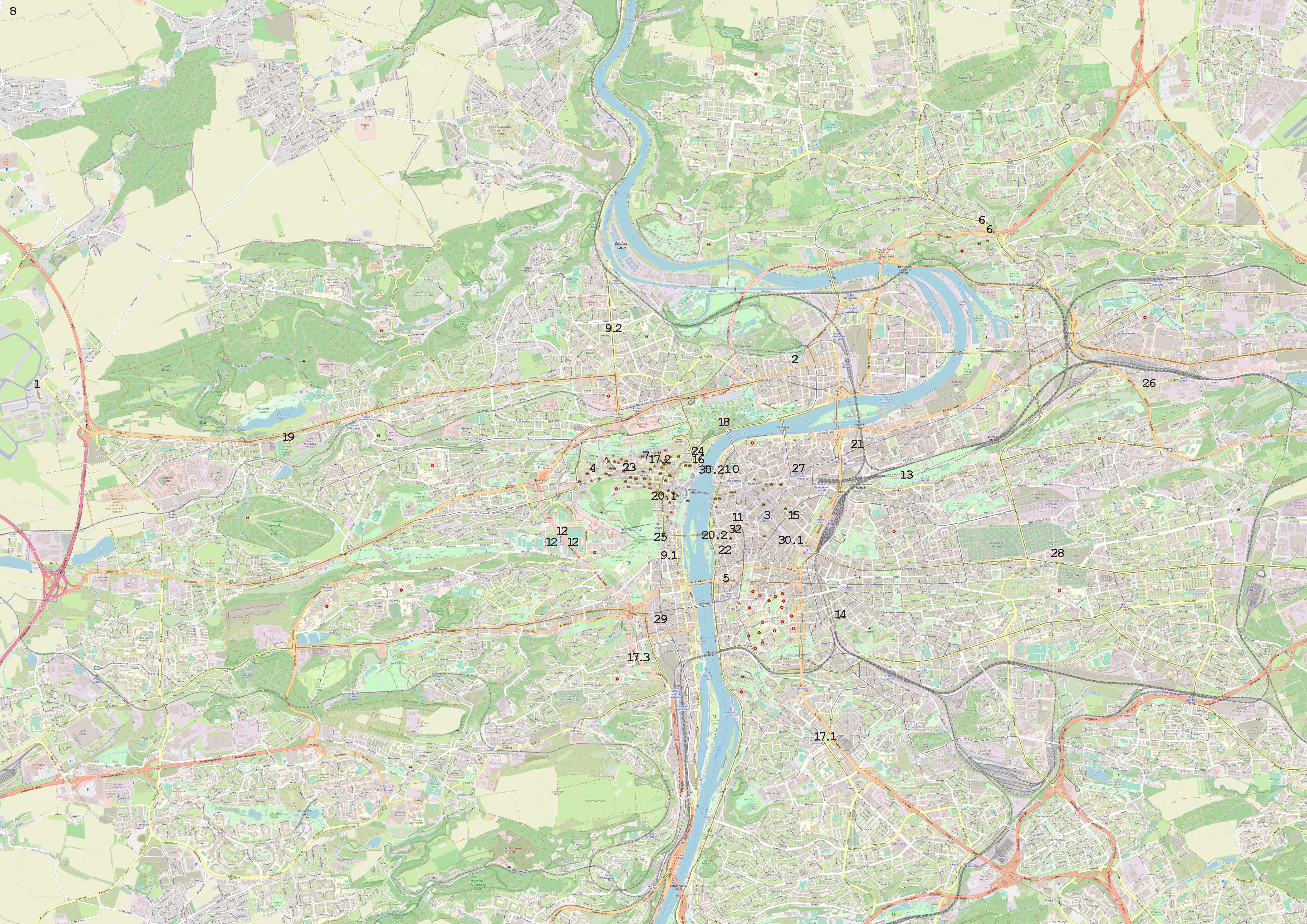
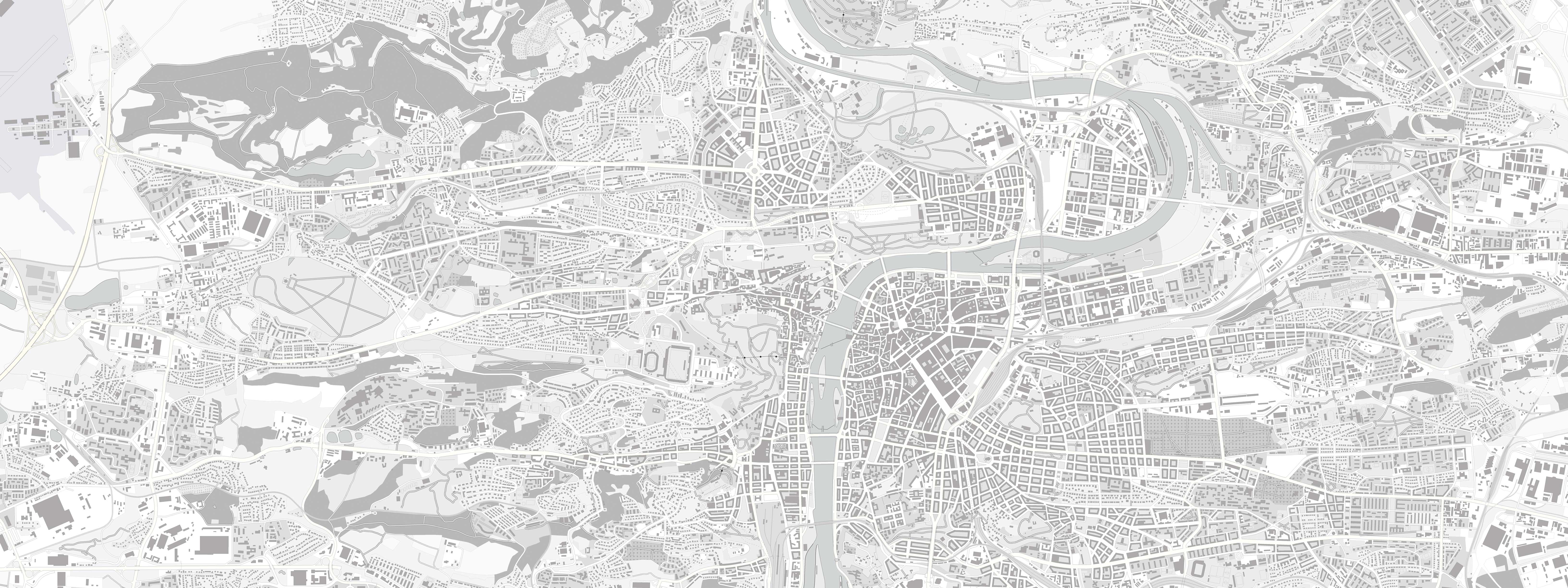
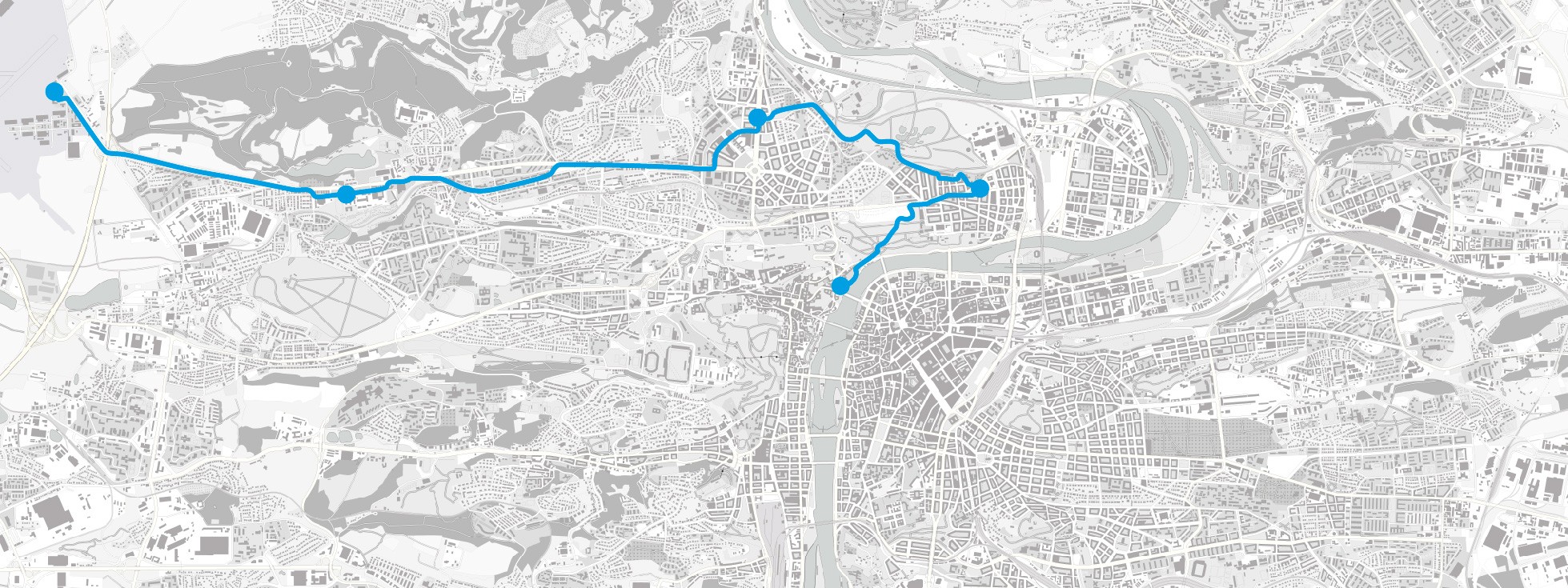
I created a highly scalable map of Prague to provide an overall view of the city and the base asset to make a graphical animation of the marathon route.
The map features a minimalist design with a grayscale color scheme. Data for the map was sourced from the Prague Geoportal and OpenStreetMap, and layers were meticulously composed to achieve the desired result.
Tools
QGIS, Prague Geoportal and OpenStreetMap.
Features
Emphasis on accuracy, essential style, and scalability
Course mapping
Tools used
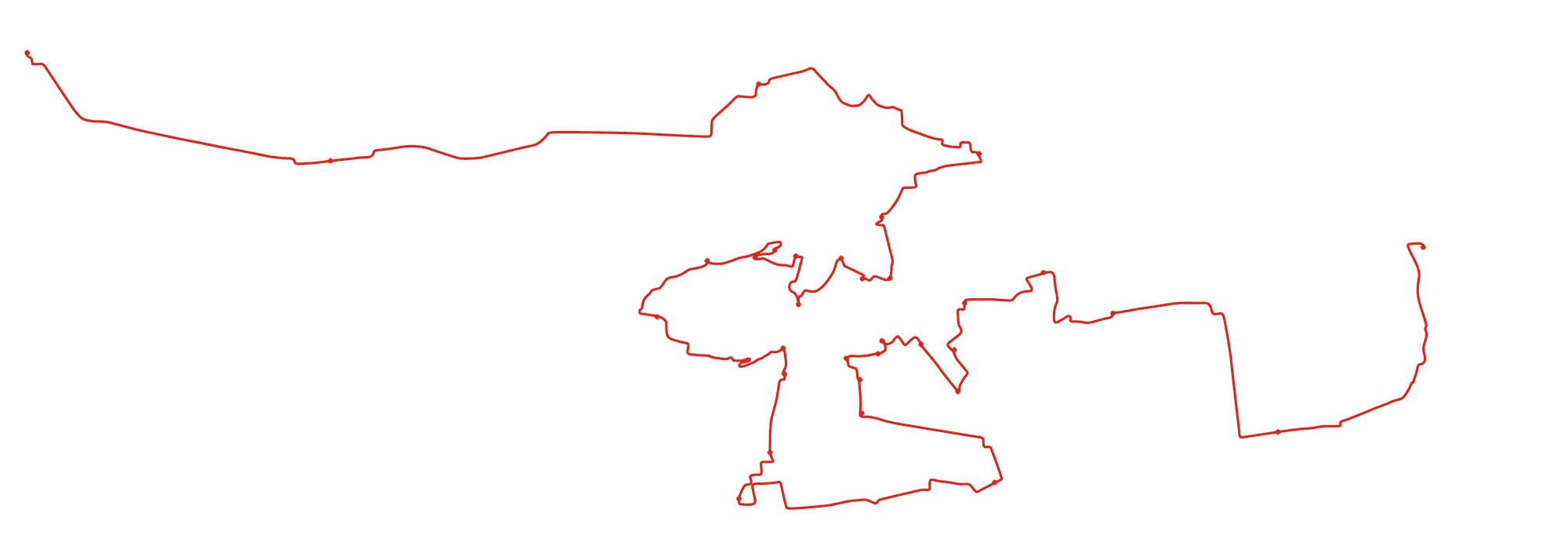
To create the marathon route I used platforms such as:
• RouteXL, for planning efficient routes commonly used by couriers (civic number)
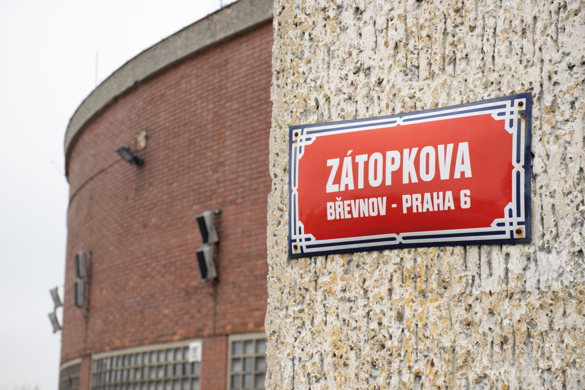
• GoogleMaps, for a more accurate second verification (geographical coordinates)
Travel
Planning
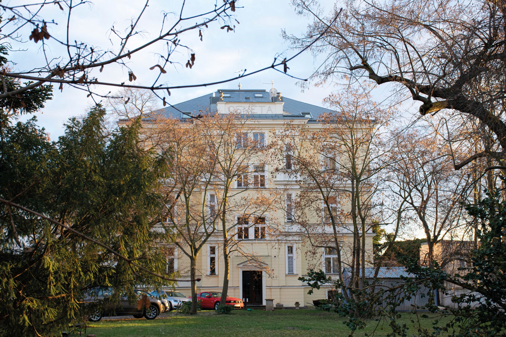
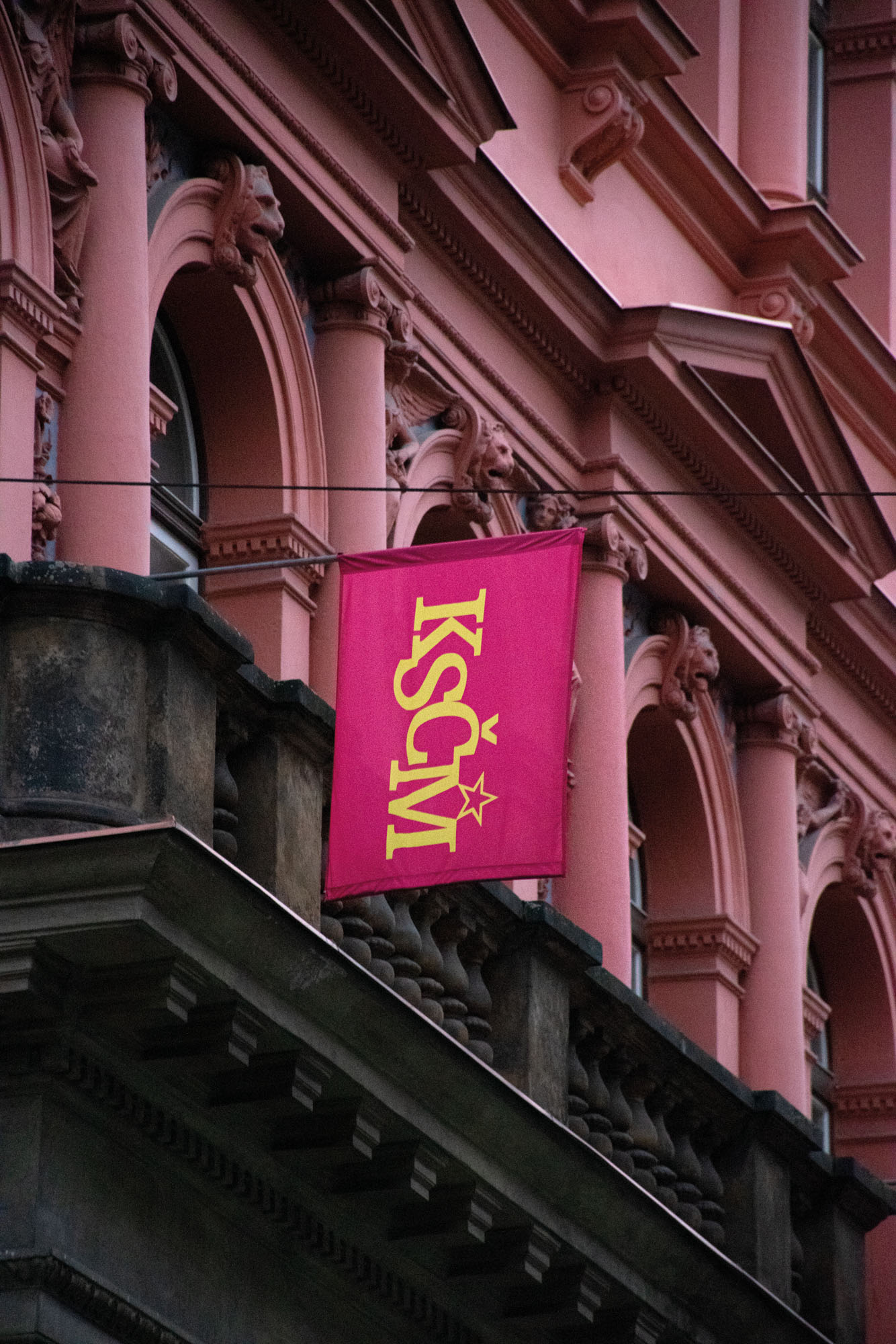
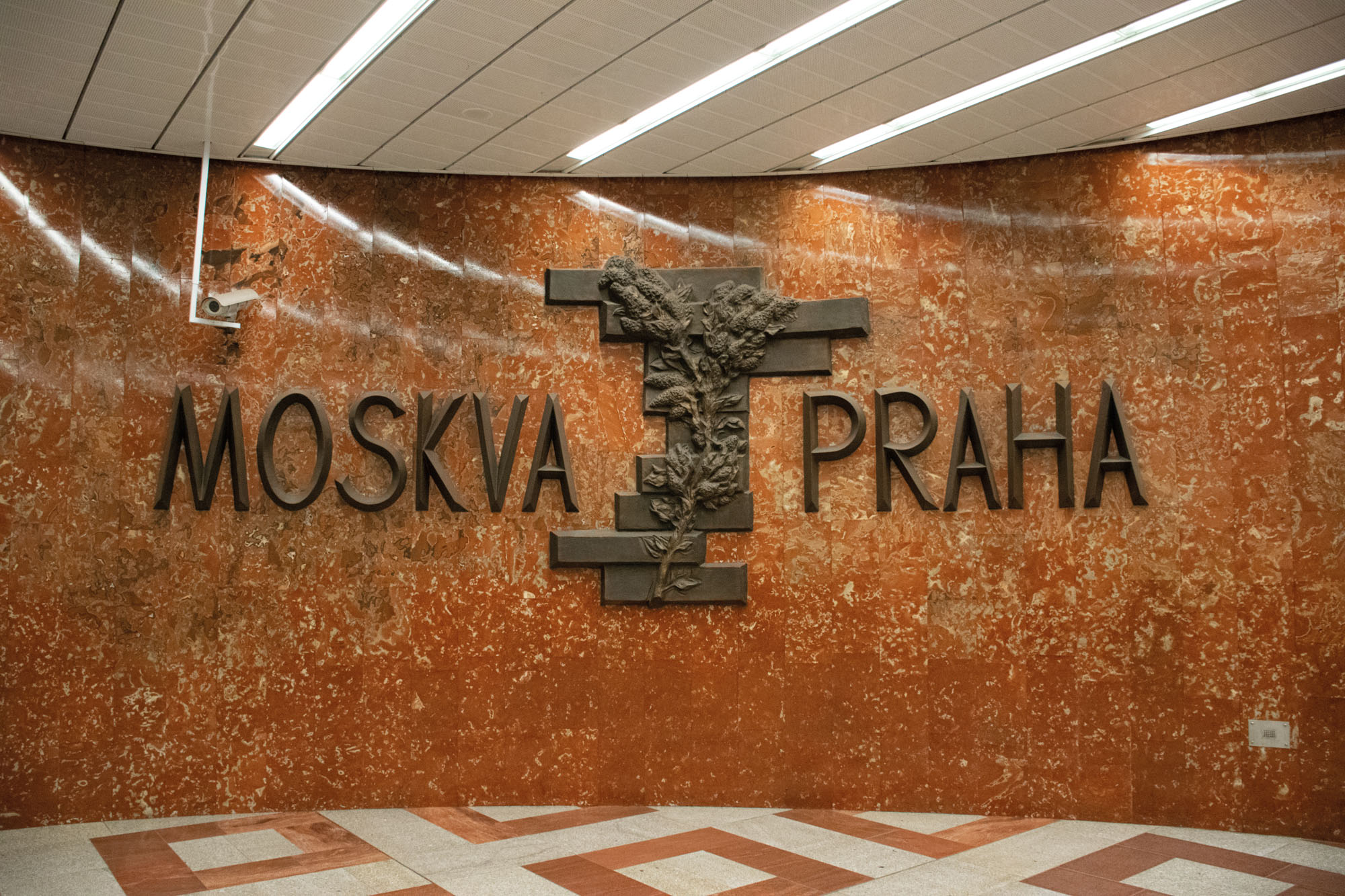
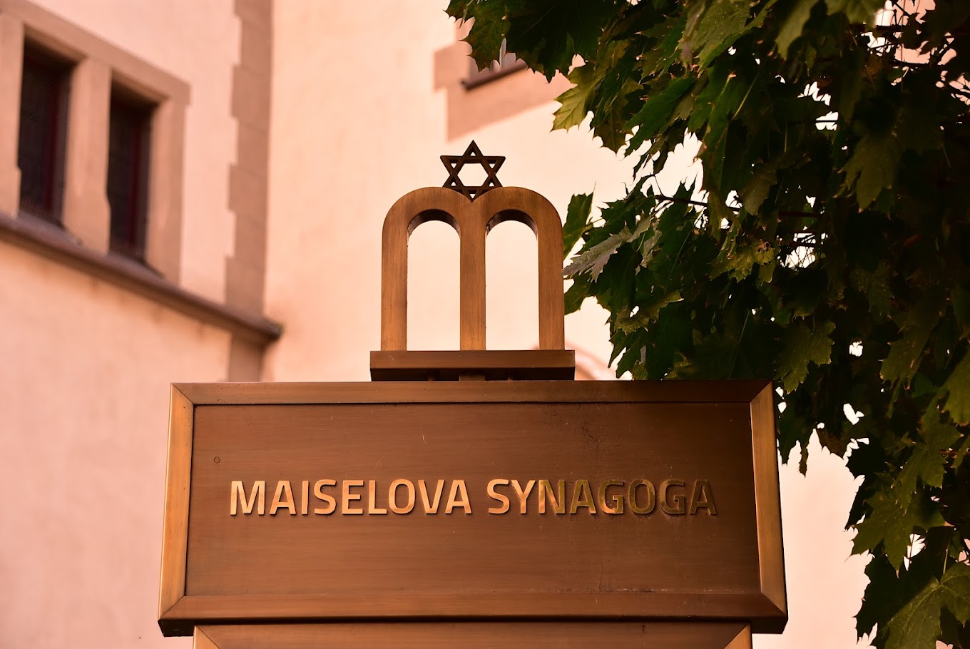
Organized itineraries for on-site photographic material collection with detailed schedules and means of transport for each segment.
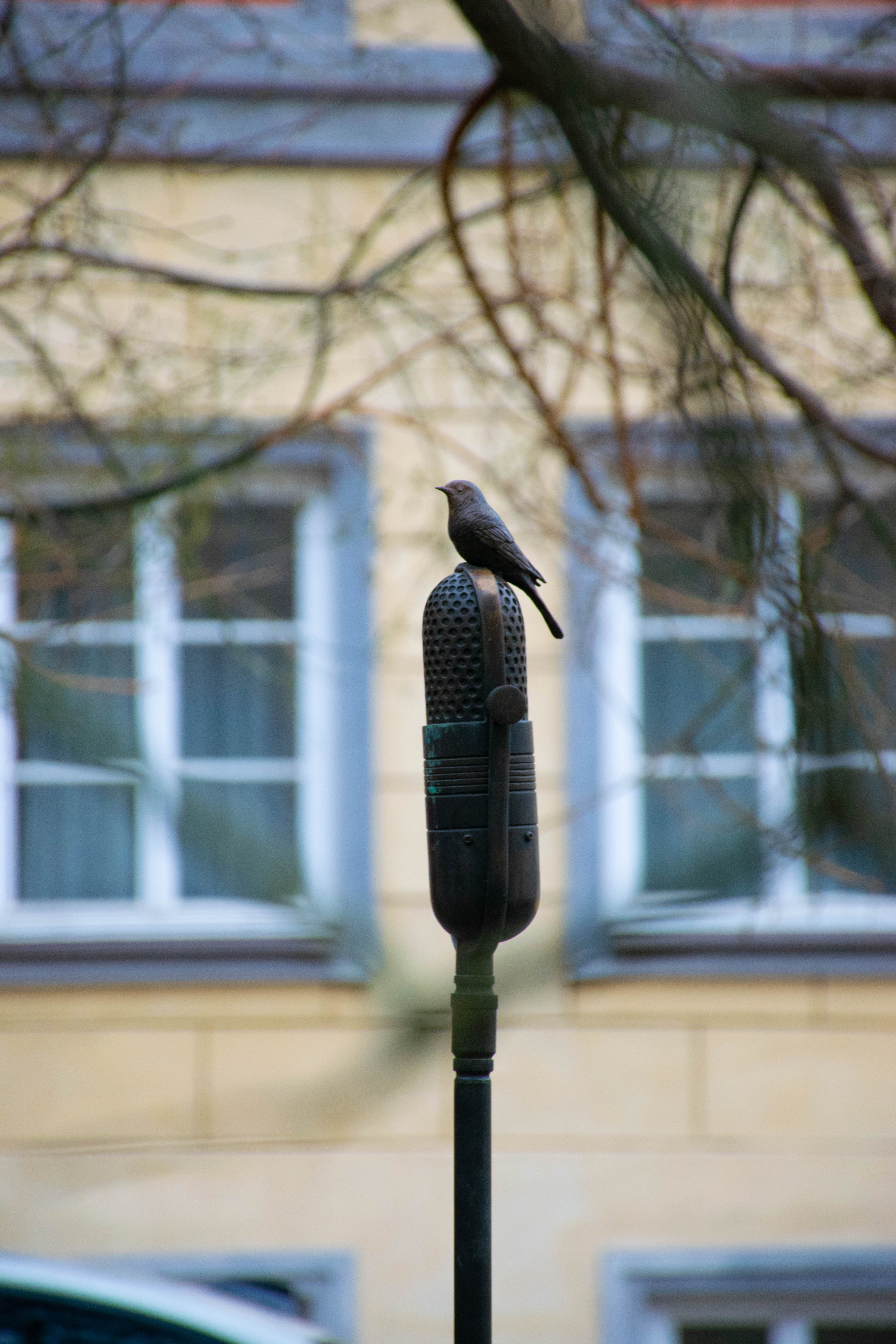
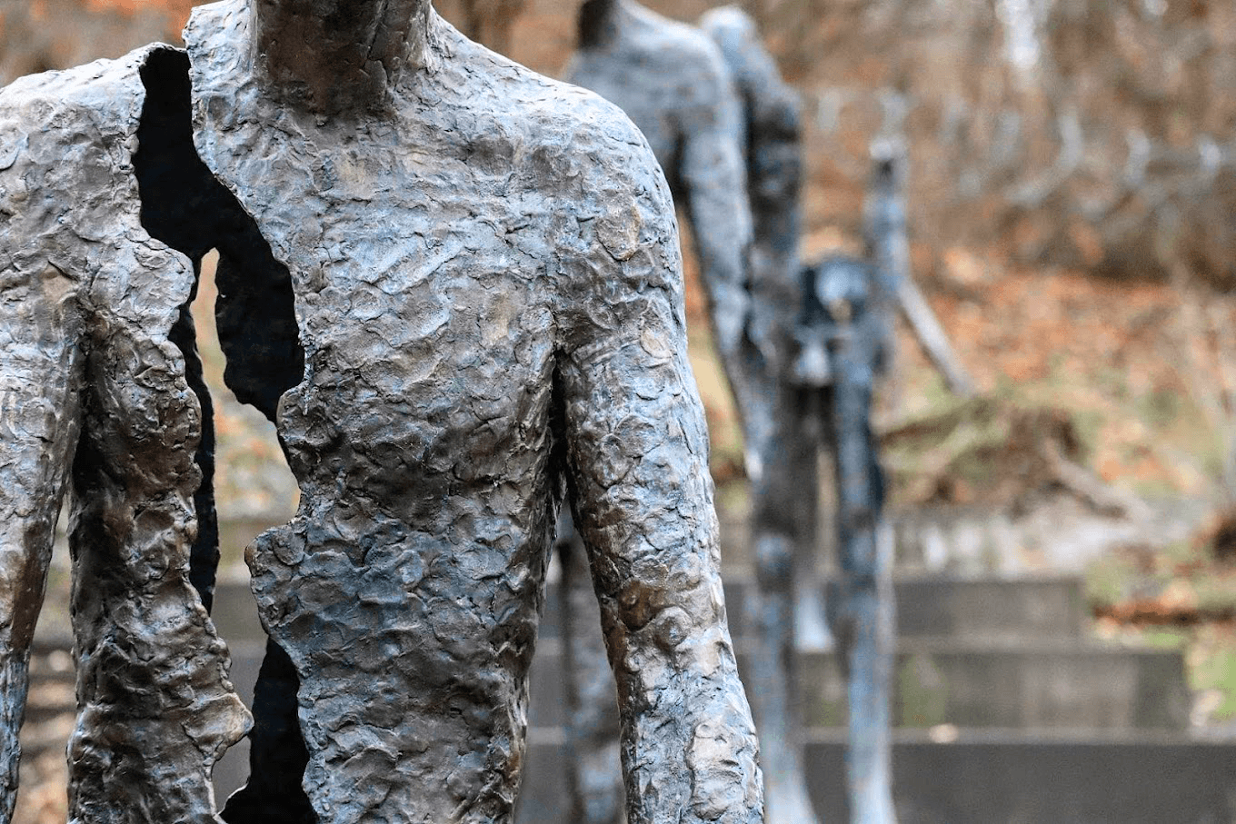
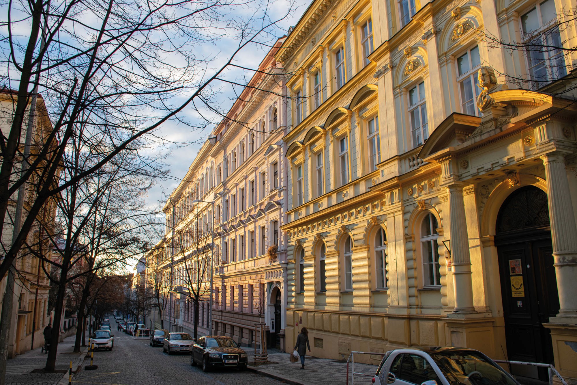
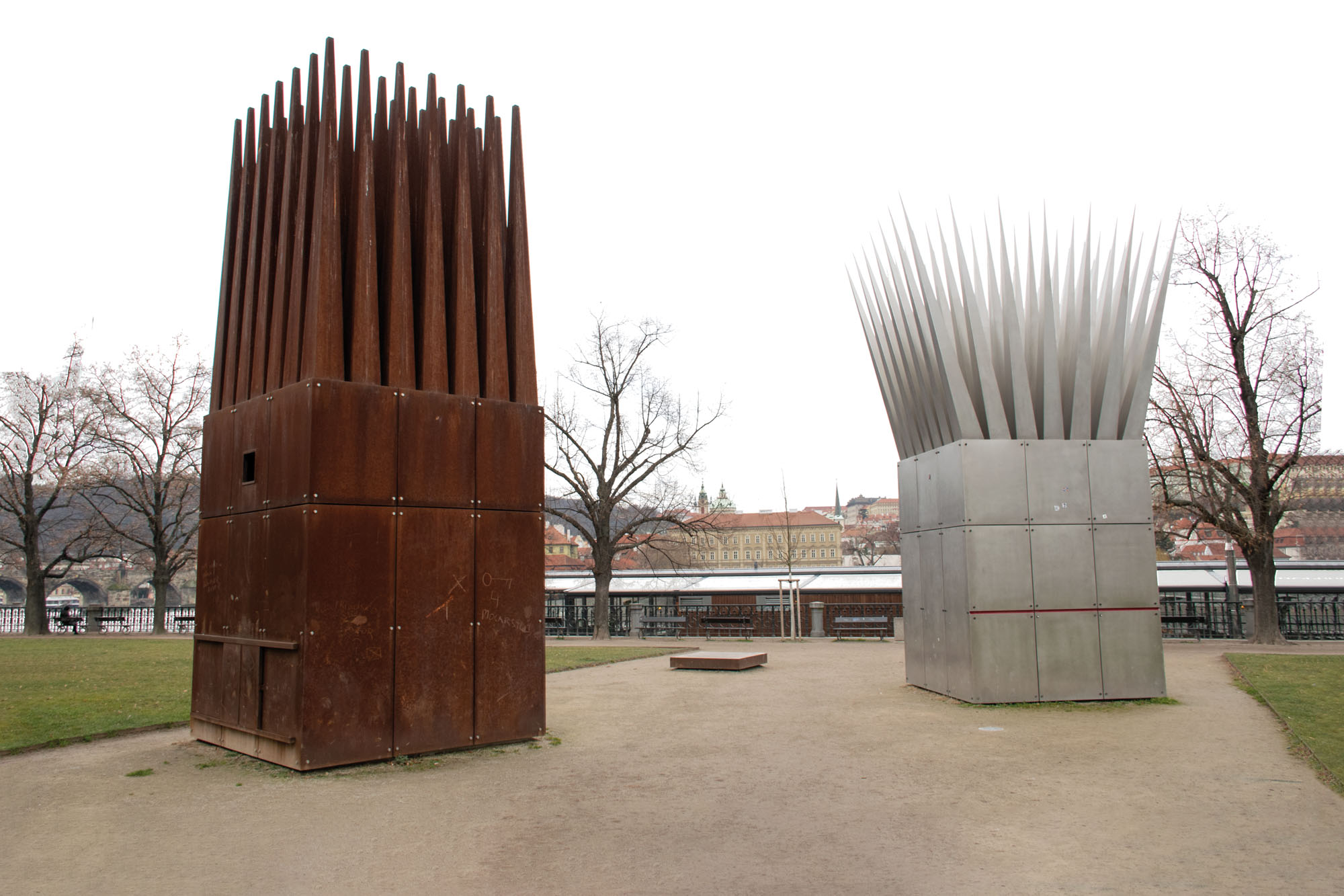
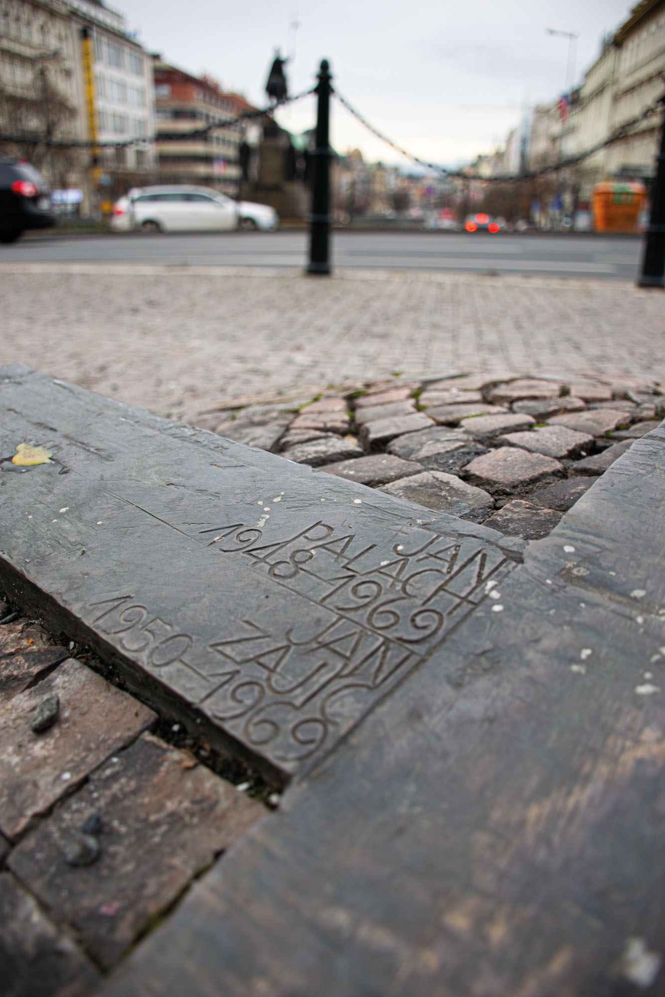
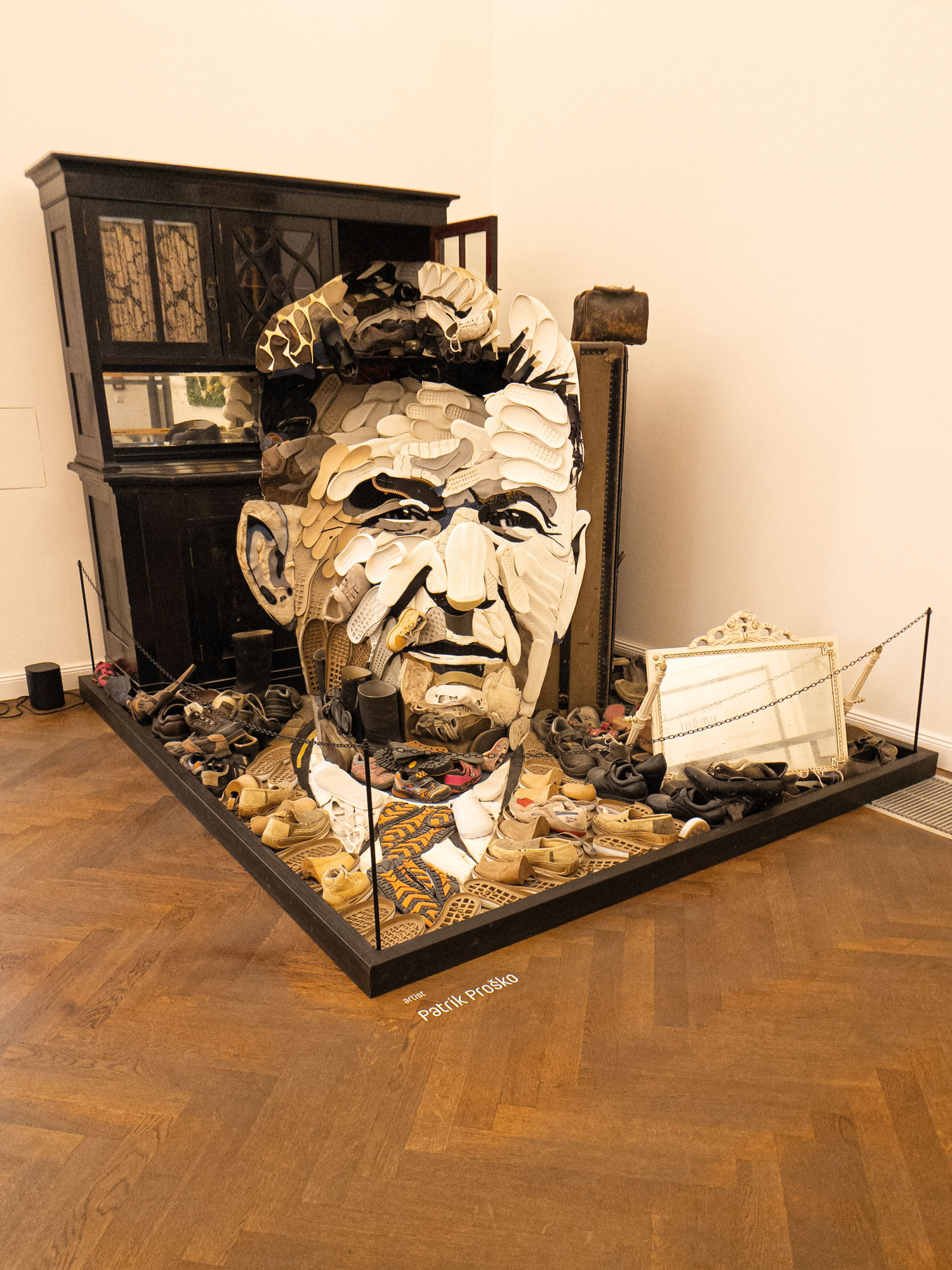
Taking photographs
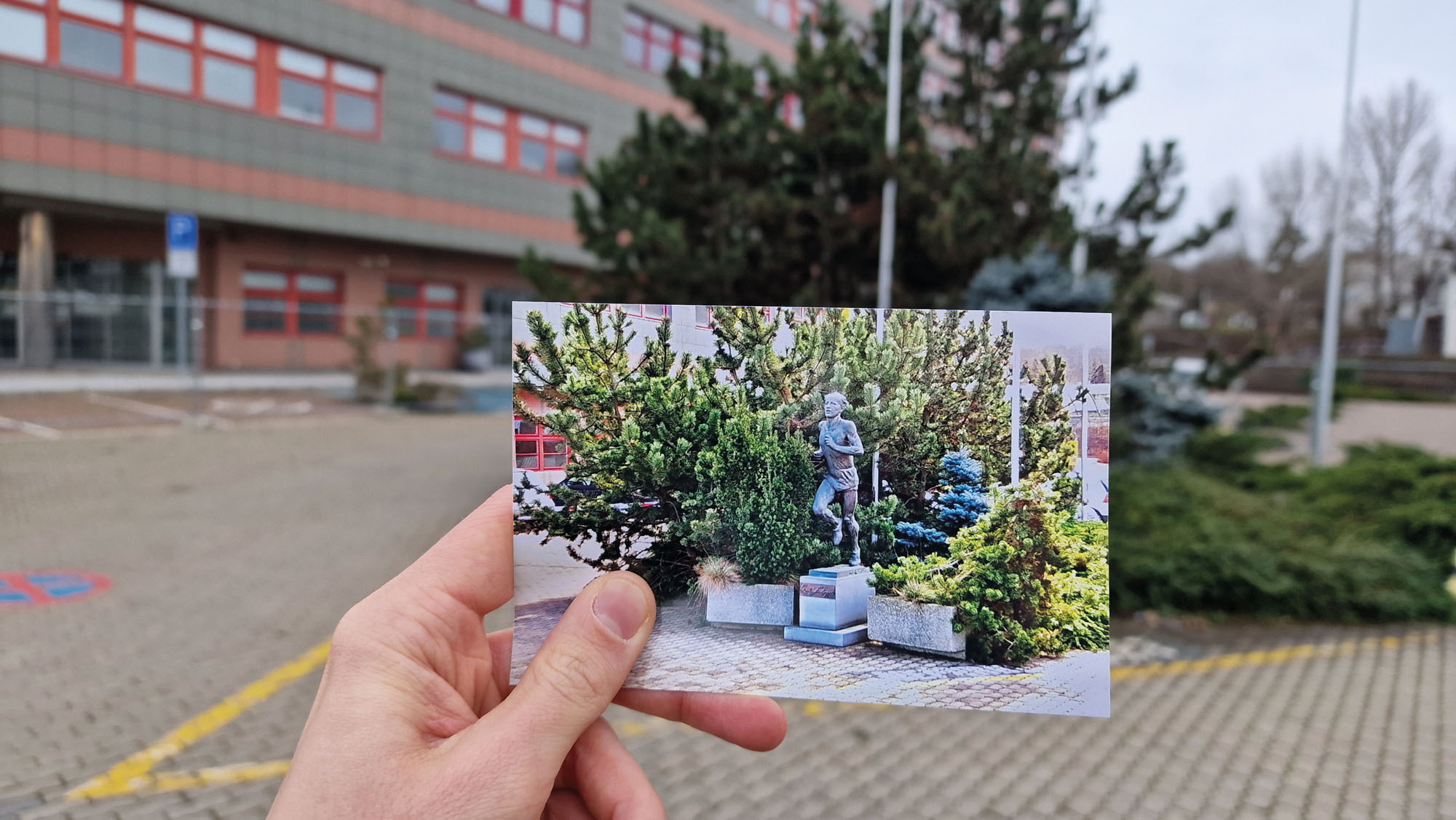
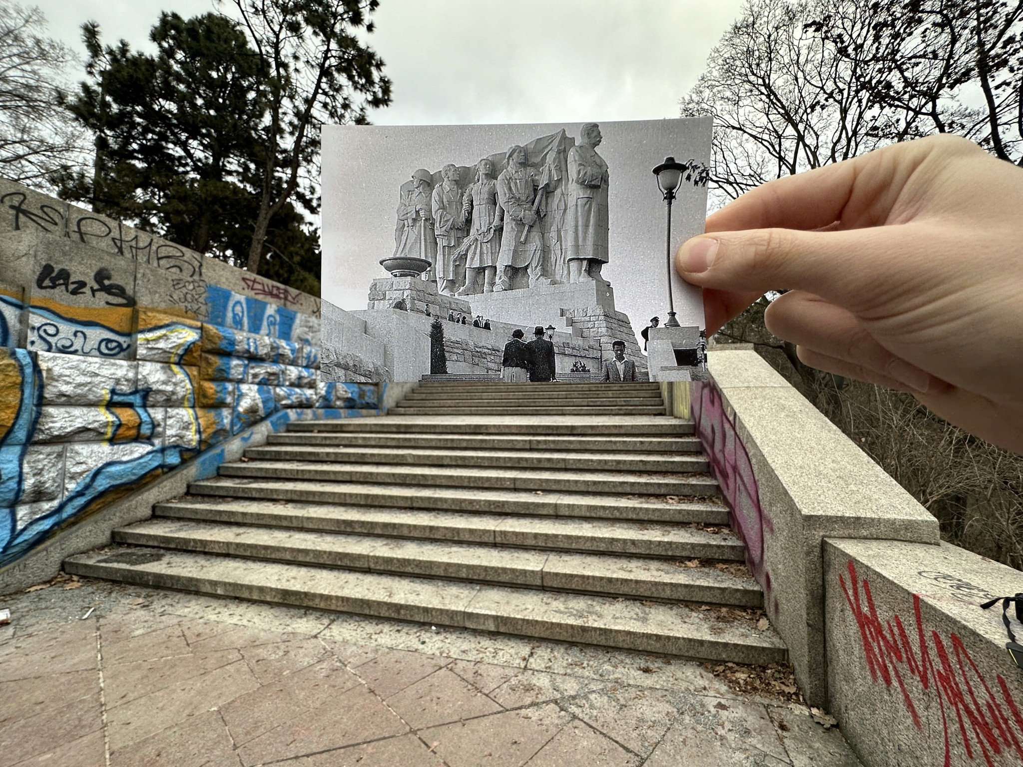
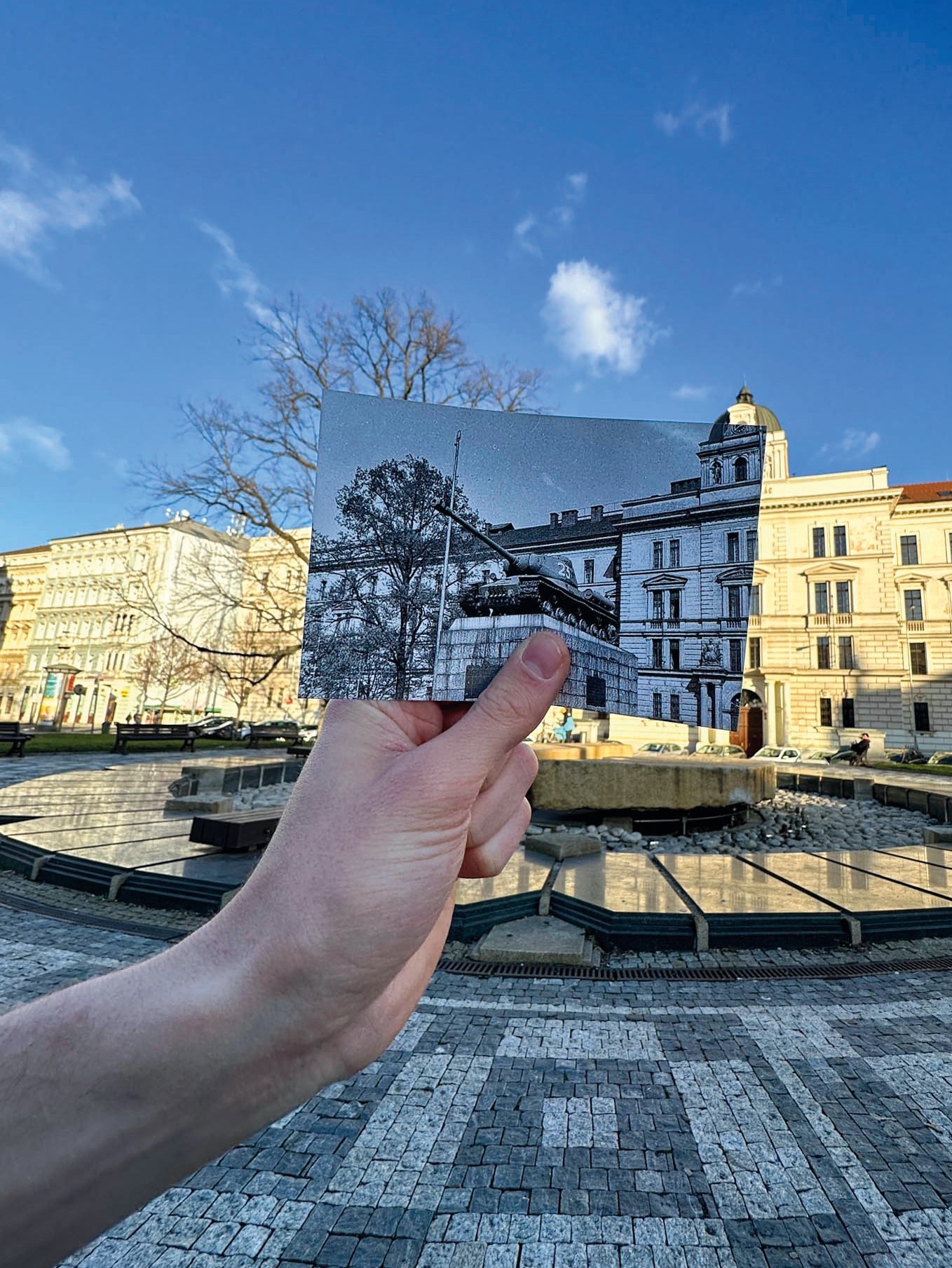
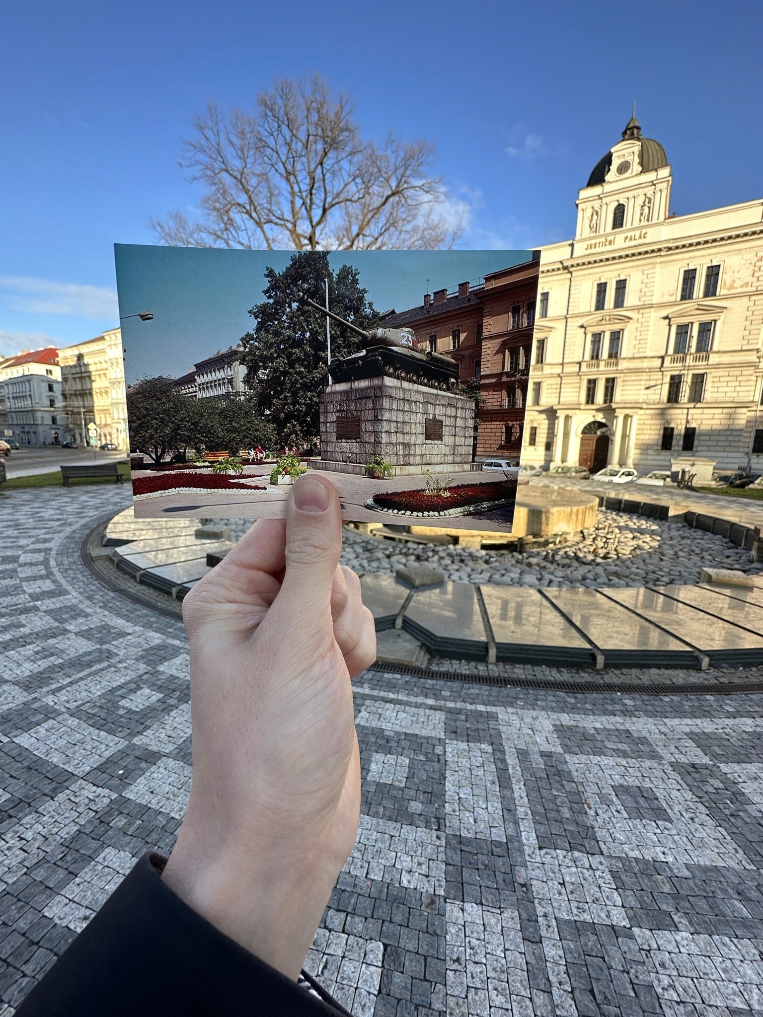
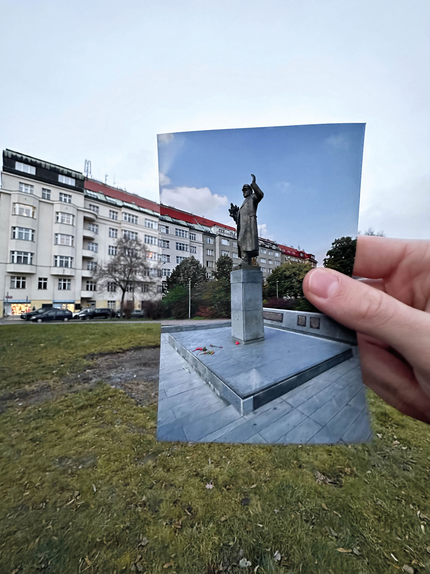
Showing removed monuments
Post-Production Process
Image Selection
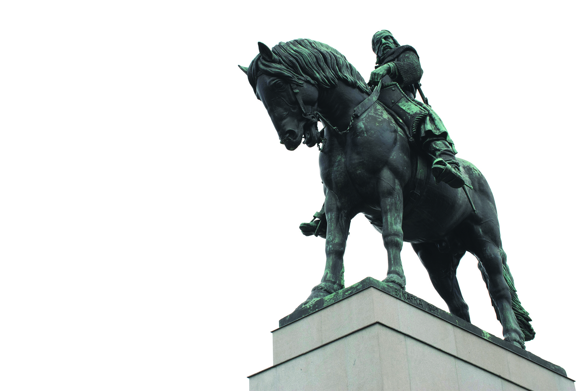
Focused on approximately 100 shots, ensuring consistency in perspectives to show subjects and their contexts effectively.
Color Enhancement
Emphasized colors in images shot in RAW format to improve quality and dynamic range using Adobe Lightroom Classic. Masking features highlighted monuments by adjusting exposure, saturation, contrast, sharpness, and tonal values while maintaining realism.
Sky Editing
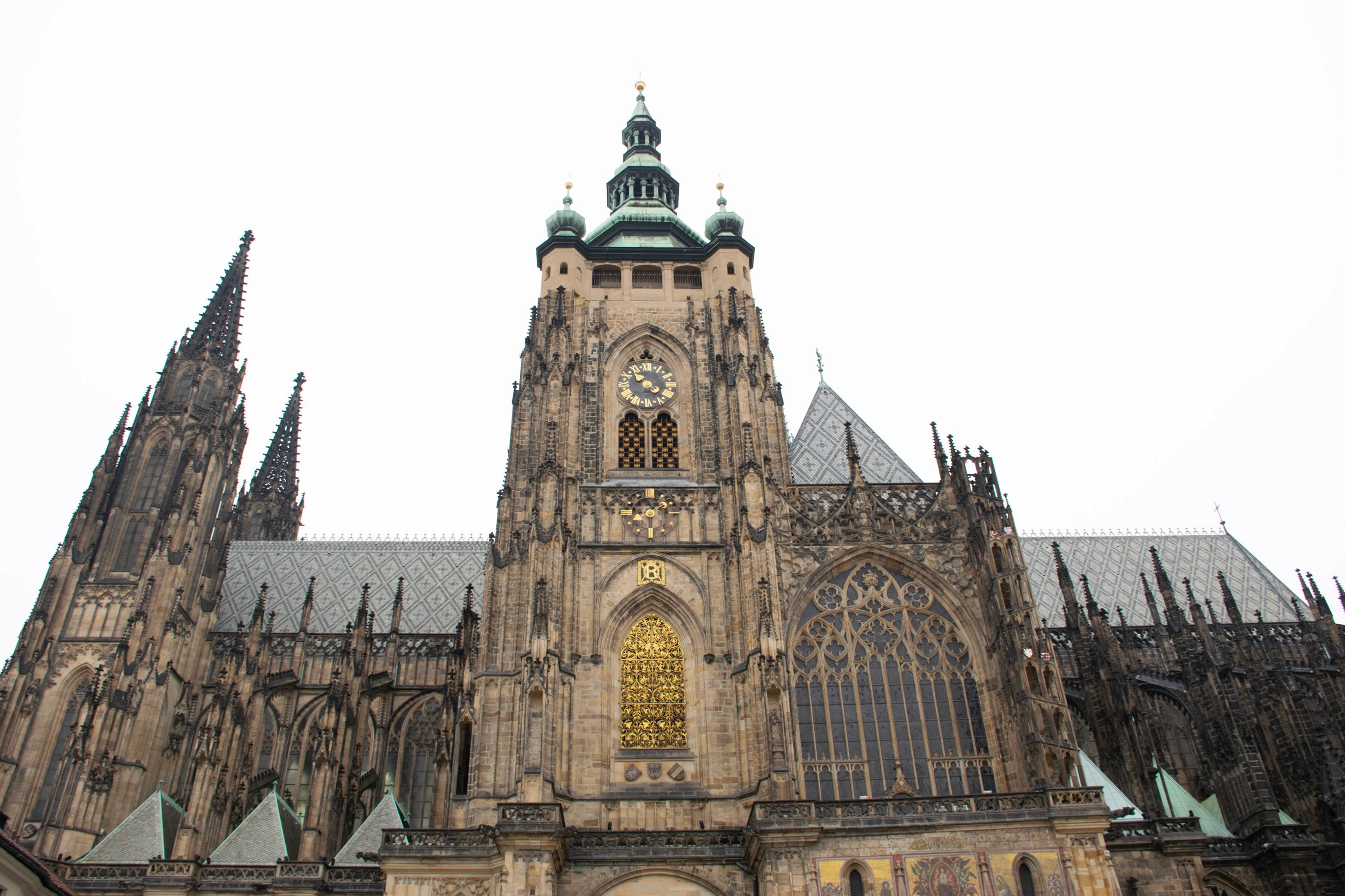
Removed overexposed sky portions to match the book's paper color, creating a cutout effect to make space for text during layout. Applied only to photos with naturally white skies for authenticity.
Perspective Correction
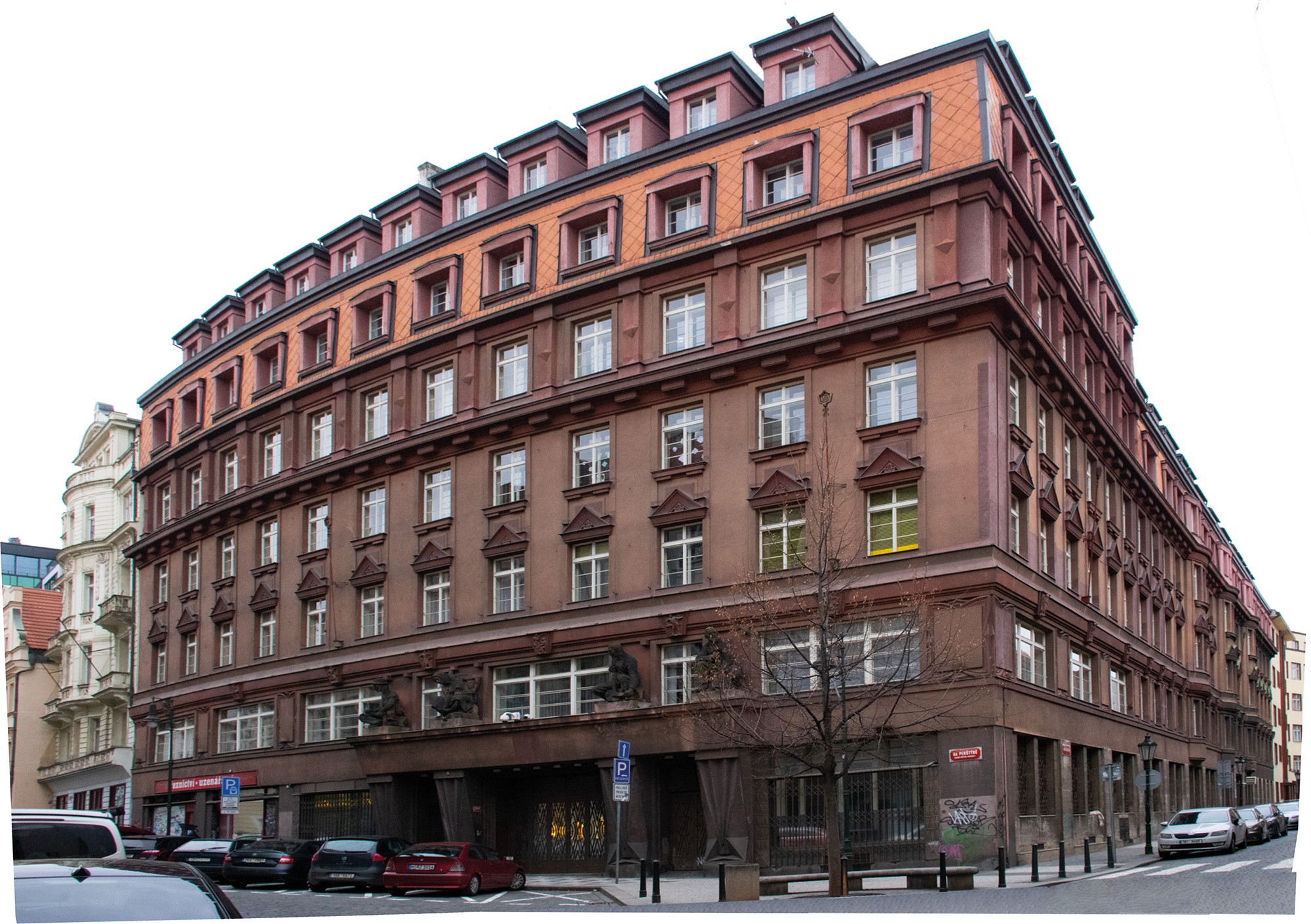
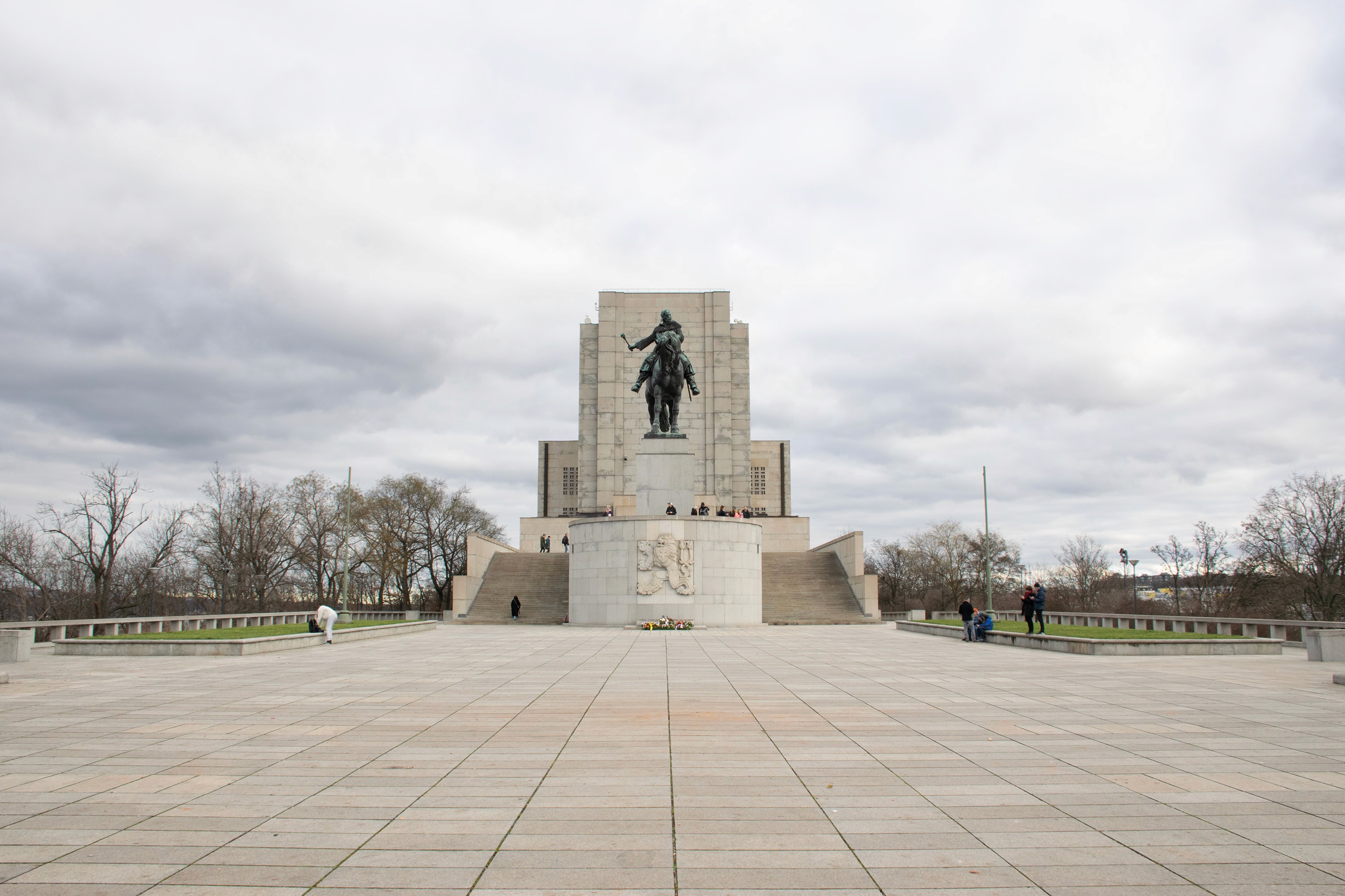
Used Adobe Photoshop to correct perspective distortions in images taken with wide-angle lenses, necessary for close-up shots of large structures like St. Vitus Cathedral, the former StB headquarters, and the Cathedral of Saints Cyril and Methodius.
Final Export
Ensured color profile consistency across images from different cameras (Nikon D5300, Samsung S22 Ultra, and iPhone 14 Pro Max) to avoid color distortion during printing. The different native color profiles have been converted to Fogra 39.
Layout and Typography
Fonts
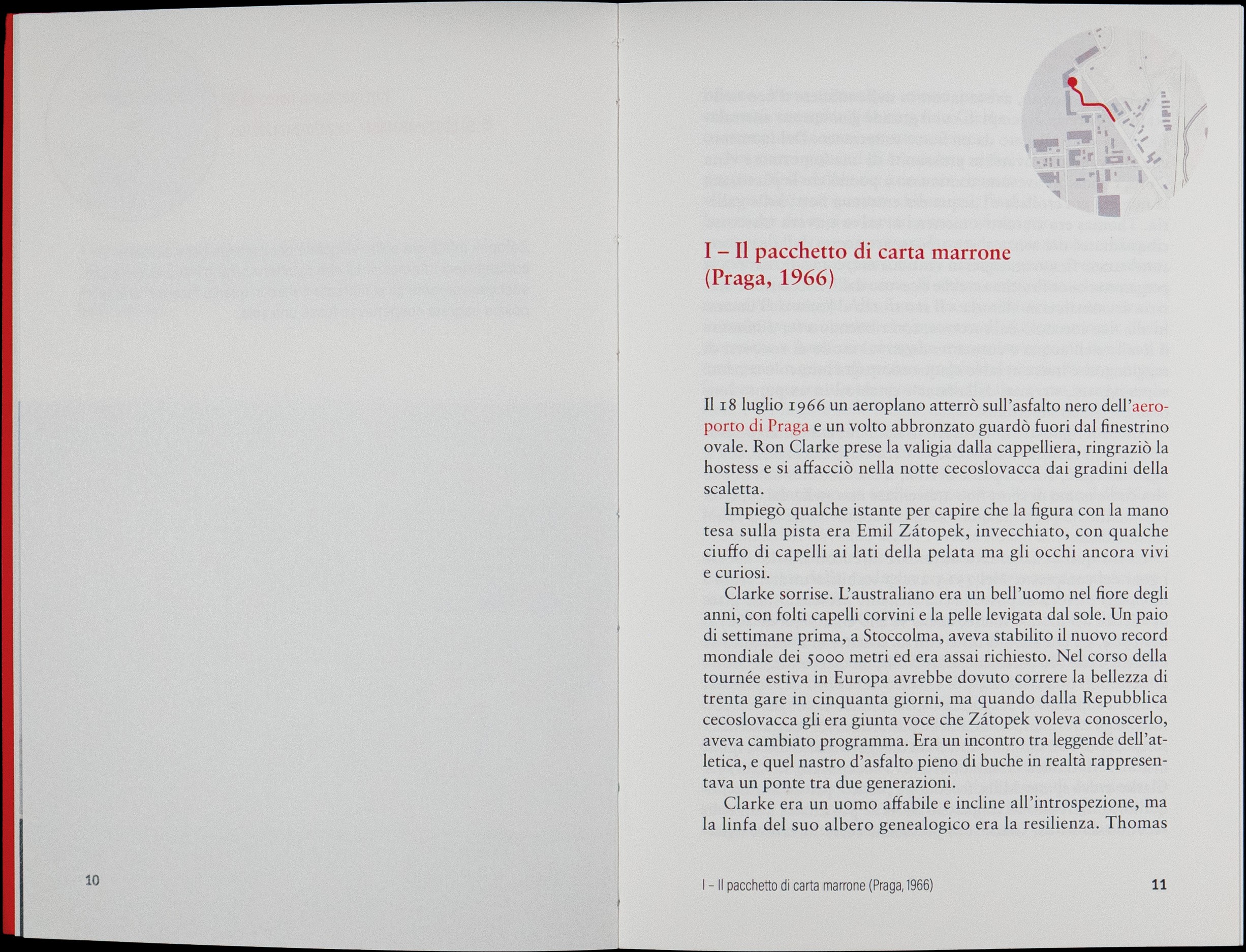
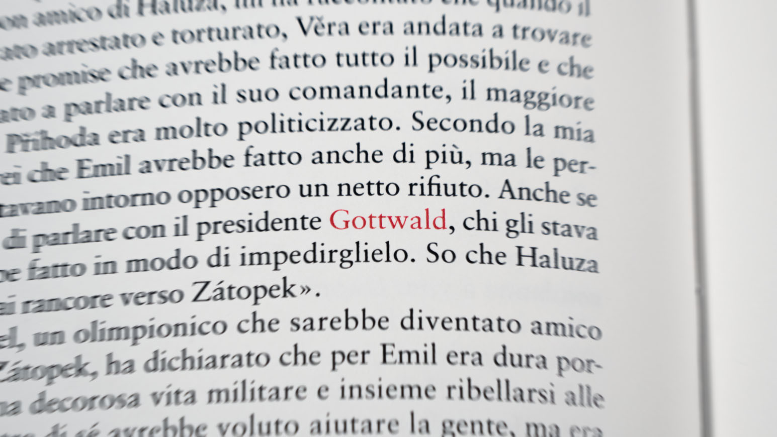
Serif: Sabon for the original text, Lucida Sans for chapter titles
Sans-serif: Arial for additional data like stage details and in-depth texts
Layout Strategy
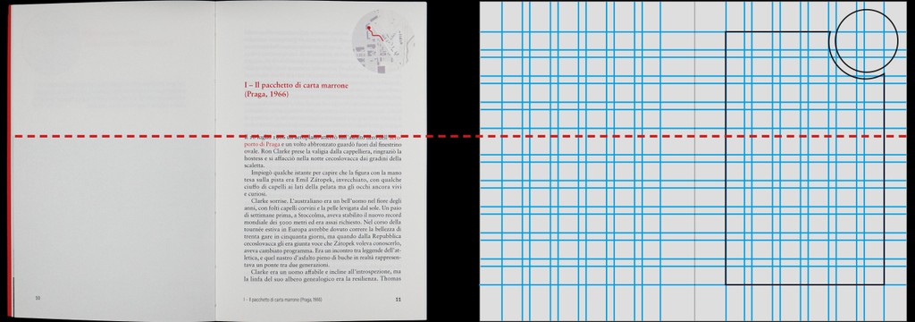
• Readability Levels: Full-page spreads for comprehensive reading, keeping the original text the original text and the integrated additions separated. The only common element being the quadrant displaying the progress of the marathon.
• Consistency: Images aligned with the text in initial pages of each chapter, additional texts at the chapter titles' height
• Color Usage: Red text for words referring to marathon stages, indexed at the book’s end for easier navigation
Cover design
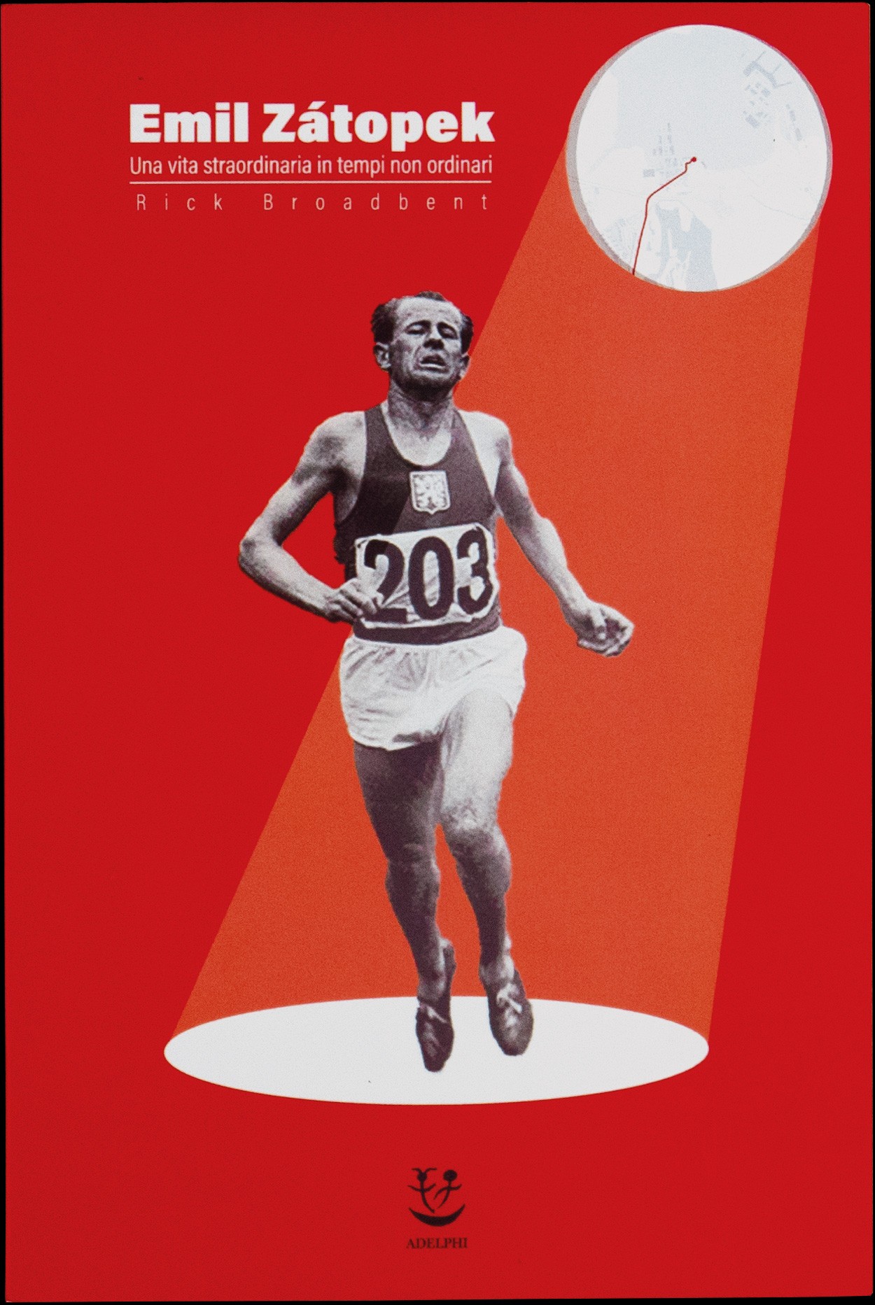
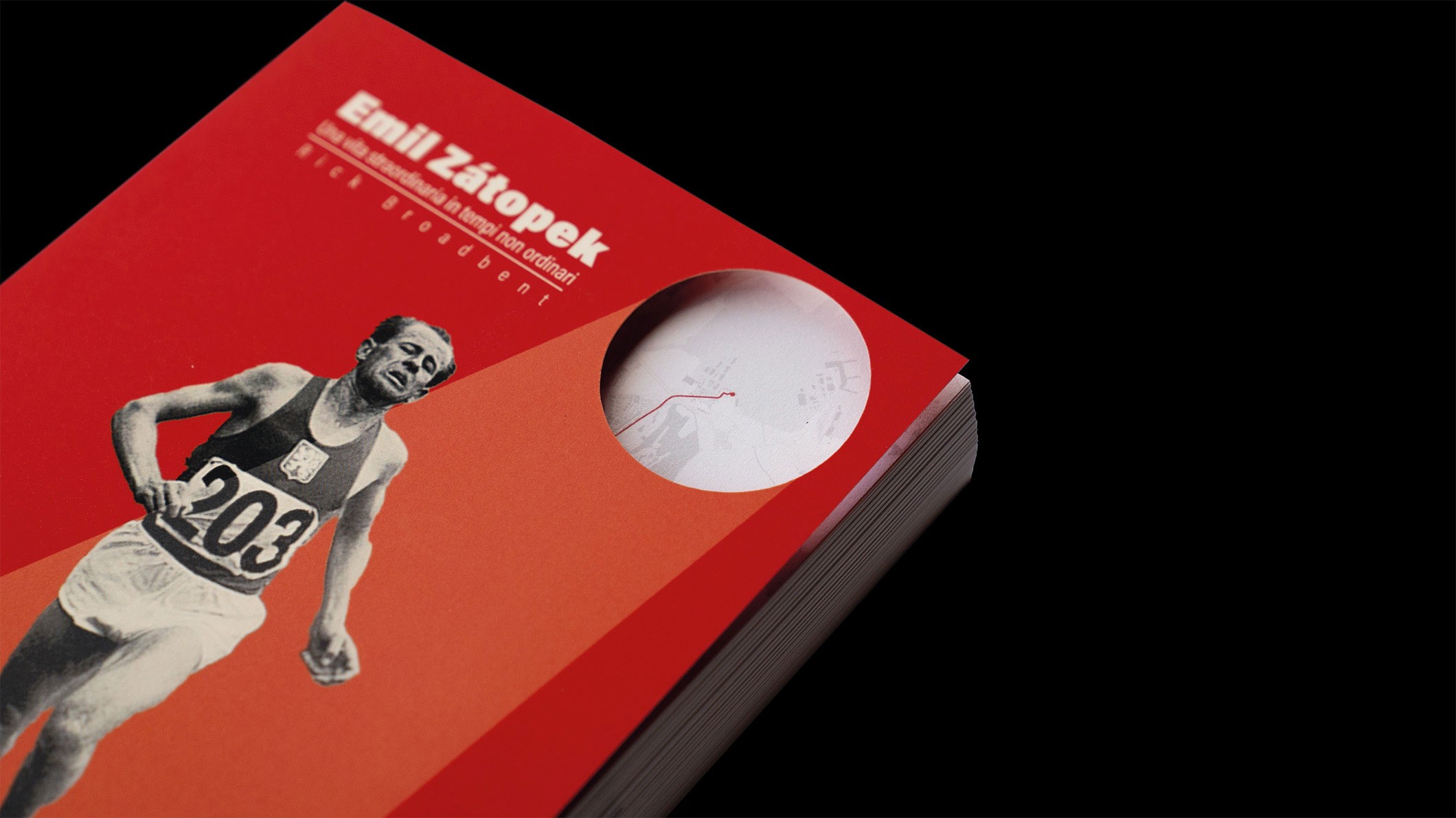
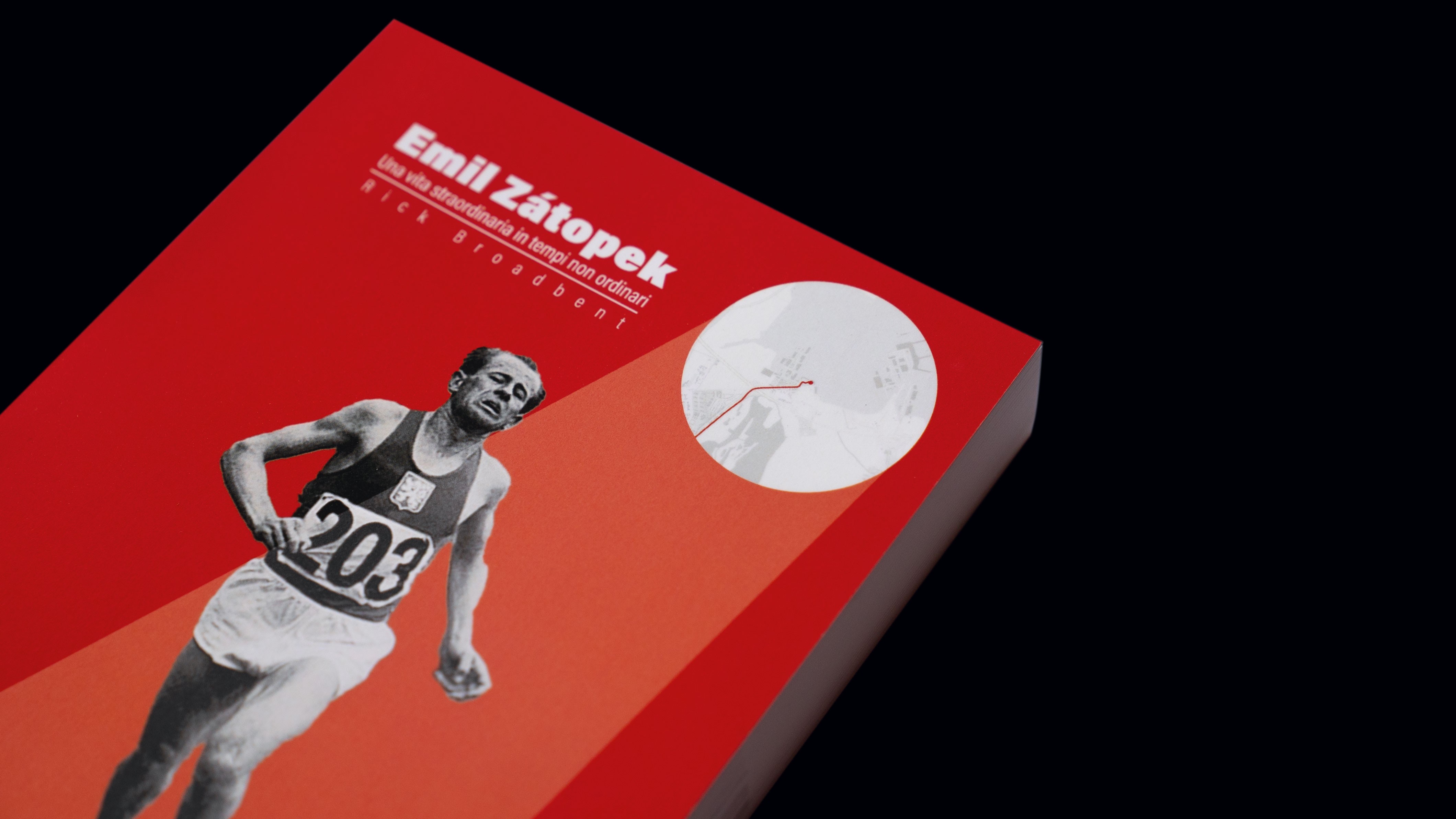
The cover visually communicates the concept by emphasizing Zátopek and highlighting the marathon’s role in valuing and exploring his history
Printing and Binding
Printing variations
• First Edition: Cover with a cutout quadrant using plotter cutting
• Second Edition: Full cover suitable for industrial production
Both editions reveal a "second cover" with a map of Prague and the marathon route, accompanied by Zátopek’s inspirational quote.
Binding
Sewn paperback (brossura filo refe), allowing wide openings for viewing double-page photographs and providing stability for a flipbook format.
Conclusion
Printing
The final output is the result of a synergistic process that combined:
Meta-design
Publishing
Digital cartography (GIS system)
Video animation
Course mapping
Photography and its post-production
